Poor letter spacing can lead to comical mishaps and frustrating design blunders. Whether it’s a typographical error or a formatting oversight, these spacing fails can turn a simple message into an unintentional joke.
In this article, we’ll explore some amusing examples of poor letter spacing that will make you chuckle and appreciate the importance of precise typography.
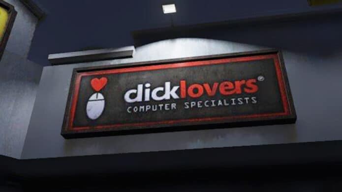
1. Computer specialists, you say.
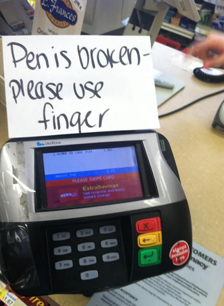
2. Detailed instructions…
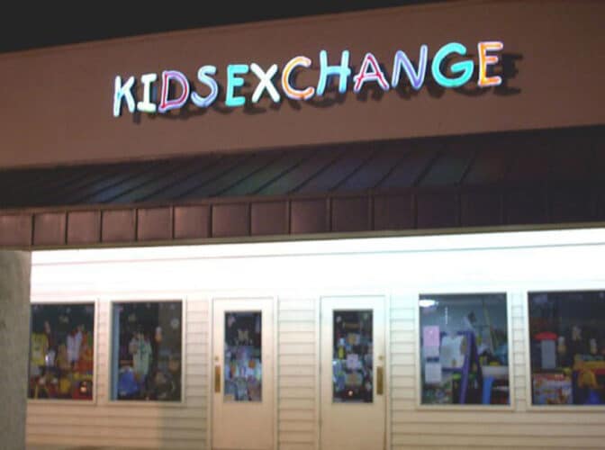
3. I hope the kids have a say.
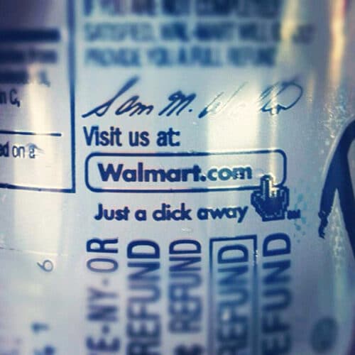
4. This website might be NSFW.
-- Advertisement --
5. A recurring theme here, hmm…
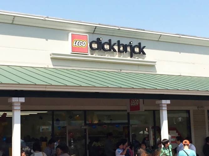
6. I don’t give a Mega F@#K!
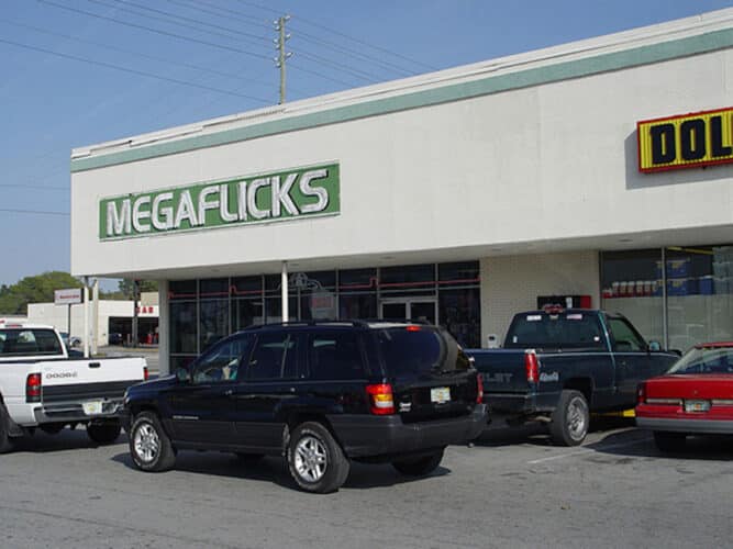
7. Always good to be prepared.
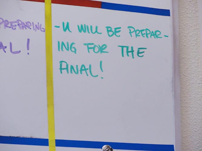
8. Little space, a big difference for a common word.
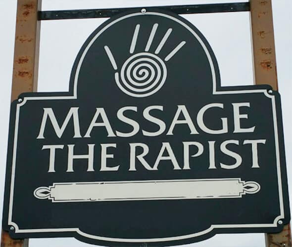
Advertisement
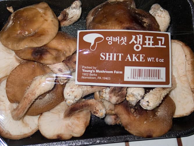
9. On a budget for low-quality Ake.
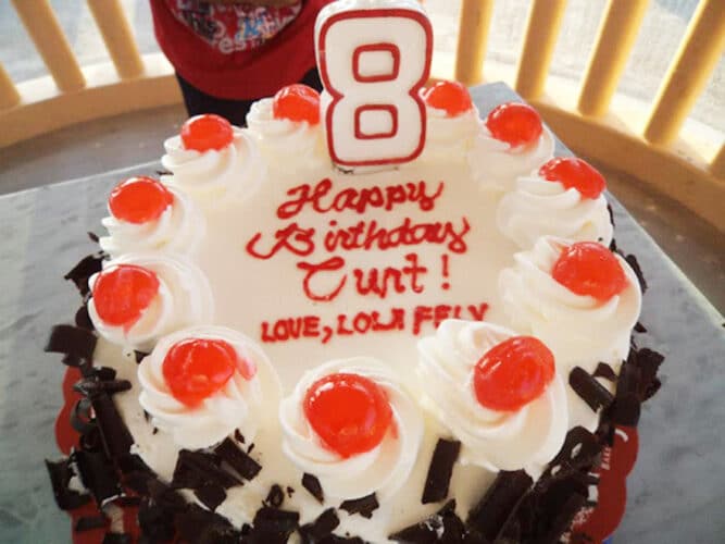
10. What a sweet birthday message.
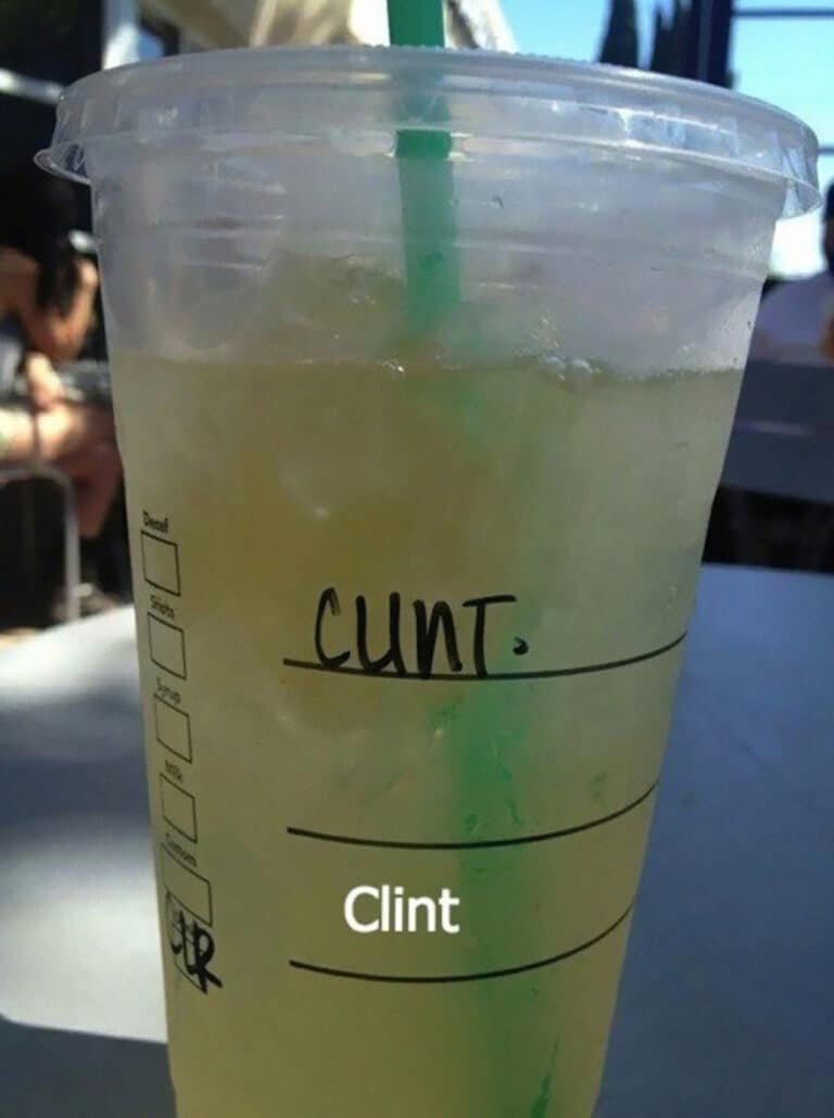
11. Clint probably encounters this a lot.
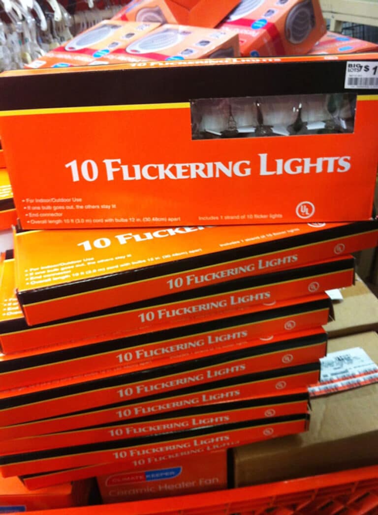
12. Not sure about messing with these lights.
13. No idea about the intended store name.
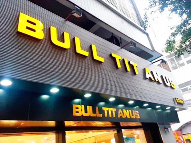
14. Changing spacing won’t make a difference.
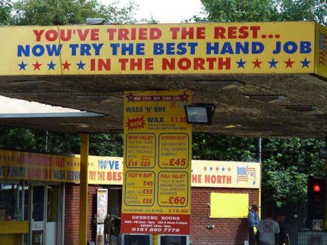
15. Now open for business!
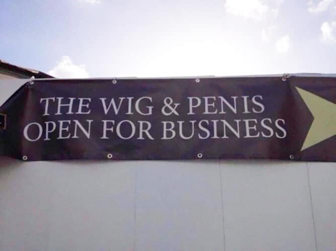
Did you find these poor letter spacing fails funny? Let us know in the comments.

OMG, I’m still laughing and my cheek/jaw bones are aching.