Did you know there’s a little secret hiding in that Starbucks logo we all recognize so well? Before we get to the juicy details, let’s take a quick step back into the Starbucks story.
The figure on every cup is a siren, a mythological character from the sea, reminiscent of the captivating figures found in stories like Herman Melville’s Moby Dick. And here’s a fun fact: even the name “Starbucks” is a nod to this classic piece of literature.

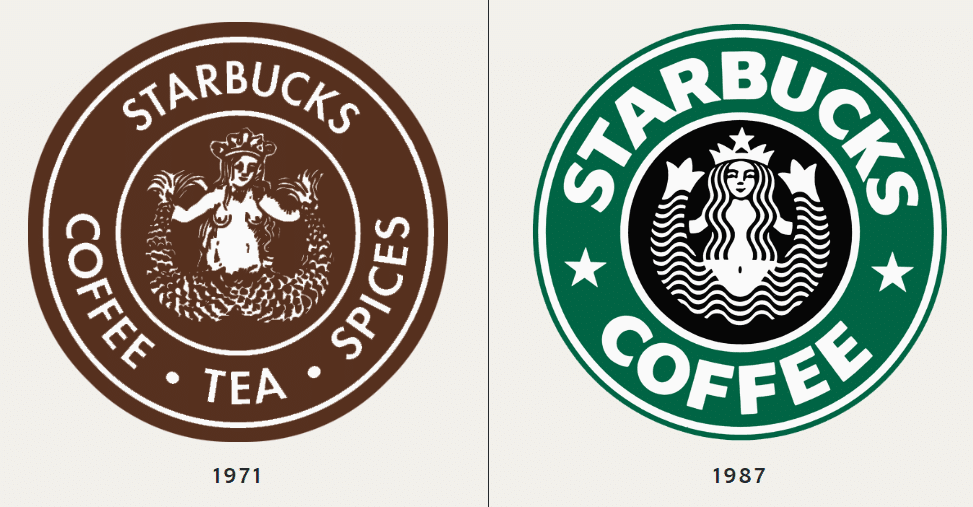
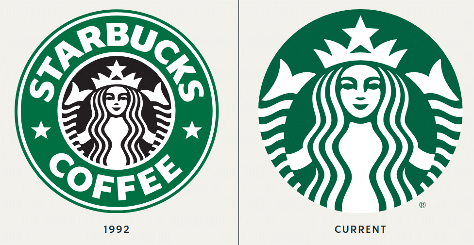
Now, let’s talk about the evolution of this captivating logo. From its humble beginnings, the Starbucks emblem has gone through several transformations. Picture this: it started in a brown shade, later diving into the now-iconic green in 1987. By 1992, as Starbucks went public, the logo received a sleek, modern update.

But the biggest change came in 2011, when the words “Starbucks Coffee” disappeared from the logo, leaving the siren front and center. She became more symmetrical, more mysterious, and the focus of the brand.

But here’s where it gets really interesting. Take a closer look next time you sip your latte. There’s a small, almost imperceptible detail in the siren’s face that’s easy to miss at first glance. Her face seems symmetrical, but if you look closely, there’s a slight tilt – the right side of her face is subtly more shadowed than the left. Her nose dips just a bit more on the right, and her right eye is slightly obscured, hiding in the shadow cast by her nose. This detail wasn’t a mistake; it was intentional. The Starbucks team wanted to give her a more human quality, believing that absolute perfection was too impersonal.
It’s these tiny, easily overlooked details that add layers to the Starbucks experience. So, next time you’re holding that warm cup of coffee, ready to take on the day, give the siren another look.
