
20 Creative Escalator Advertisements That Are Super Cool
In the competitive world of out-of-home media, escalator advertisements stand out as one of the most effective ways to reach an urban audience.
Advertising is one of the most key parts of a business’ marketing. The way a brand gets promoted to the customers should always be simple yet fascinating.
Viral Strange has prepared a set of escalator advertisements that are super cool and creative.
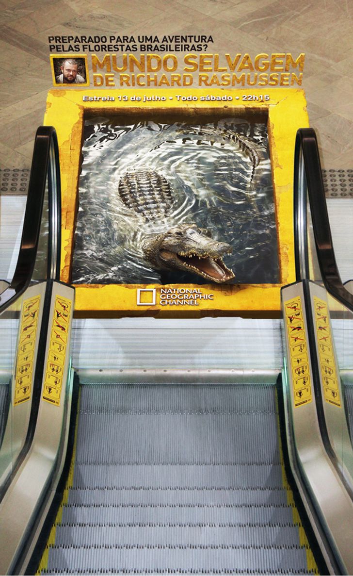
1. An adventure through the Brazilian forests
Psychologically, escalators are one of the few places in a busy city where people are forced to be still.
With no phone signal in deep subway stations or the simple need to keep one’s balance, eyes naturally drift to the surrounding surfaces.
Creative ads capitalize on this focused attention by using the mechanical nature of the stairs to their advantage.
2. Pantene’s “Hairy” Escalator
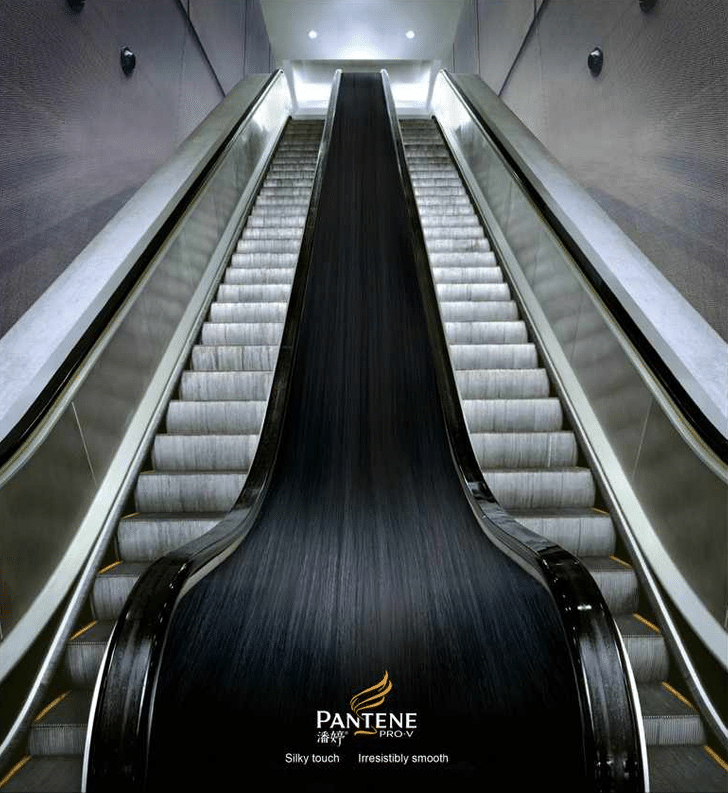
This professional campaign titled ‘Escalator’ was published on October 26, 2007.
This Ambient medium campaign is related to the Health industry and contains 1 media asset.
It was submitted over 18 years ago.
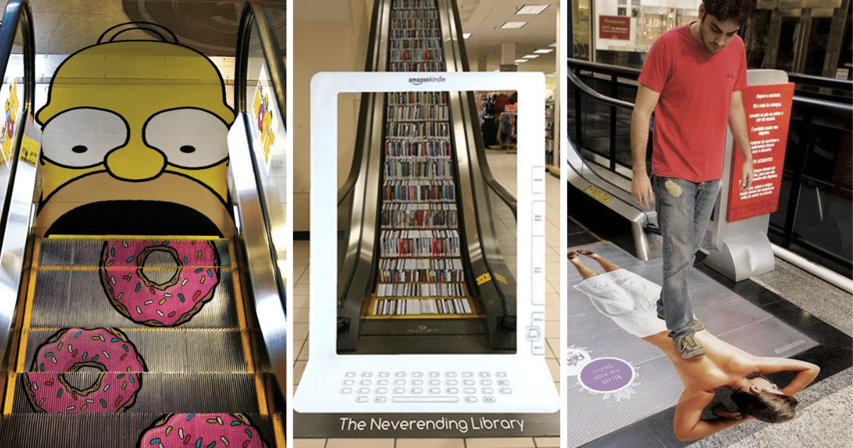
3. Homer Simpson eating donuts
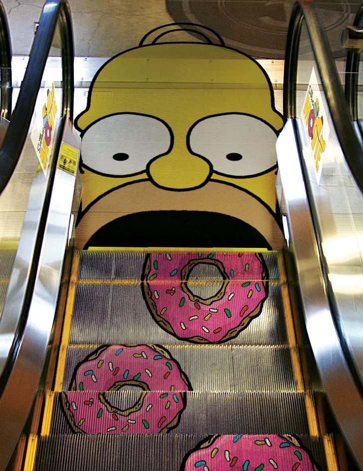
This professional campaign titled ‘Escalator’ was published in Brazil in September, 2010.
It was created for the brand: Homer Simpson.
This Ambient medium campaign is related to the Media industry and contains 1 media asset. It was submitted over 15 years ago.
4. Massage at its finest
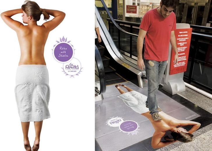
The most “super cool” ads in this category don’t just sit on the surface; they interact with the architecture.
We’ve seen escalators transformed into giant rolls of film for movie festivals, endless sushi belts for restaurants, and even deep canyons for travel agencies.
5. Highlighter
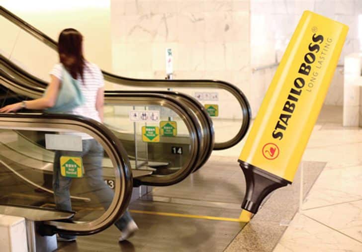
To capture the long-lasting ability of Stabilo highlighters, giant pens were installed at the beginning of escalators throughout Hong Kong.
As the steps continually moved forwards, the pen appeared to create the bright yellow safety marks on the side of the steps – non-stop from morning to night.
What makes escalator advertisements so visually striking is the clever use of repeating patterns.
6. Kitkat
Because an escalator is composed of identical, moving segments, designers have a unique opportunity to play with symmetry and motion.
This level of creativity turns a functional piece of machinery into a talking point.
It’s no longer just a way to get to the second floor; it’s a piece of street art that people actually want to photograph and share on social media, giving the brand a second life online.
7. Apple Apps
8. Very long Hubba Bubba
An ad that looks distorted from the bottom of the stairs might snap into perfect focus as you ascend, creating a “reveal” moment that delights the viewer.
A single image can be fragmented across the steps, only to align perfectly from a specific vantage point.
This interactive element is why escalator ads often have higher recall rates than traditional posters.
9. Long-lasting batteries
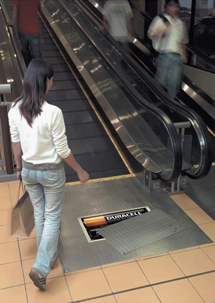
Published in Malaysia in October, 2005. It was created for the brand: Duracell, by ad agency: Ogilvy & Mather.
This Ambient medium campaign is related to the Electronics, Technology industry and contains 1 media asset. It was submitted over 20 years ago.
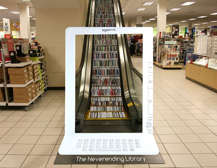
10. The Neverending Library
11. Cheesyway to heaven!
In the world of outdoor advertising, the escalator is a hidden gem of creative potential.
This play on perspective turns the viewer into an active participant, as the image “assembles” itself right before their eyes.
Unlike a static billboard that you might glance at while driving 60 mph, an escalator offers a captive audience for anywhere from 30 to 60 seconds.
12. “Tangled” Advertisement
13. Coal Flag – “America would have 50% less electricity if coal miners didn’t make this trip every day.”
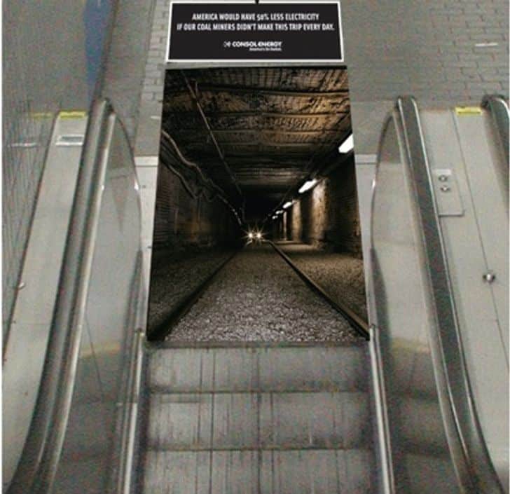
This campaign is titled ‘Coal Flag, Escalator’, published on October 01, 2006.
This Ambient medium campaign is related to the Industrial industry and contains 1 media asset. It was submitted about 19 years ago.
In urban environments where every square inch is saturated with noise, these creative ads succeed by claiming “dead space.”
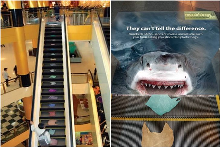
14. They can’t tell the difference.
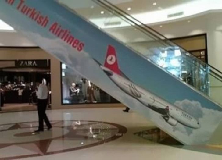
15. Turkish Airline Ad… goes south! 😀
Most people view the sides and steps of an escalator as purely functional, so when a splash of vibrant color or a witty optical illusion appears there, it breaks the pattern of expectation.
This element of surprise is a powerful psychological tool; it bypasses the “ad-blindness” most consumers have developed and forces the brain to process the new information.
People on Reddit called it “Possibly the worst airline ad ever…” What do you guys think?
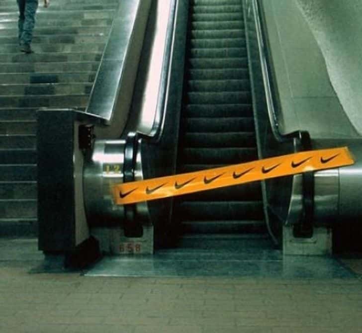
16. Just Do It.
This “dwell time” is a marketer’s dream. It allows brands to move beyond simple logos and engage in visual storytelling that literally moves with the consumer.
By utilizing the steps, the handrails, and the side panels, companies can turn a mundane commute into an immersive brand experience.
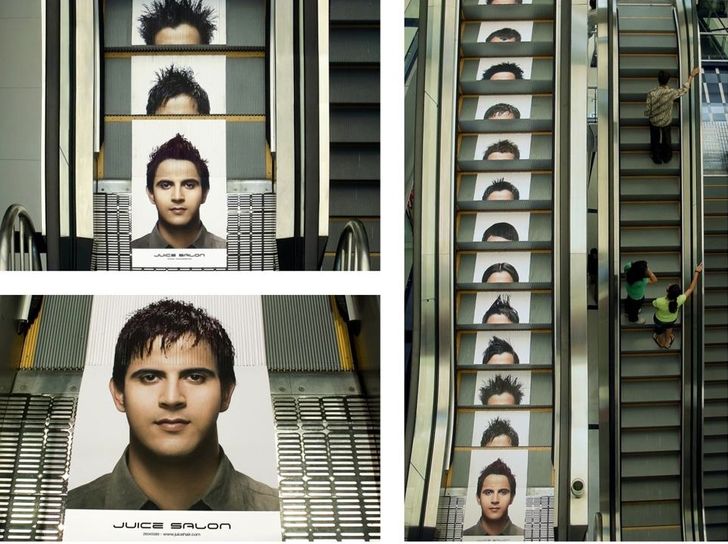
17. Different hairstyles to choose from
18. It looks yummy
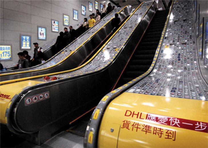
19. DHL delivery
20. Watch your returns and taxes
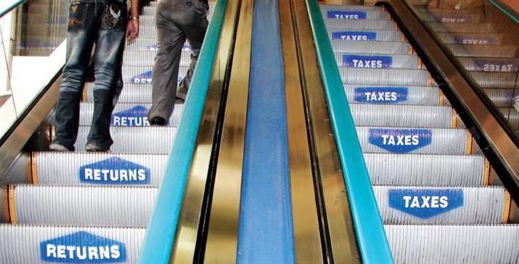
Campaign titled ‘Watch your returns and taxes’ was published in India in February, 2008.
It was created for the brand: Tata, by ad agency: Quadrant. This Ambient medium campaign is related to the Finance industry and contains 1 media asset. It was submitted over 17 years ago.
Which one did you like most? Tell us in the comments.